


Client
Philly Urban
CAtegory
Sandwhiches Brand
ARTIST
Anny's Design Studio
Product Duration
3.5 Weeks
Creative Direction
The core idea behind the Philly Urban identity was to create a visual language that feels born on the street — but designed with purpose. The brand speaks to a generation that values self-expression, individuality, and style in everything they consume.
We positioned Philly Urban as a lifestyle brand, not just a food spot. Think street culture meets next-gen fast food — sharp, confident, and unapologetically bold.
Tone & Personality

Philly Urban’s tone is playful yet tough, authentic but stylized.
It's not afraid to be loud. It's built for attention. It's a brand that belongs on the street, on your feed, and in your hands.
Visual Identity
The design system reflects the brand’s rebellious attitude and expressive personality:
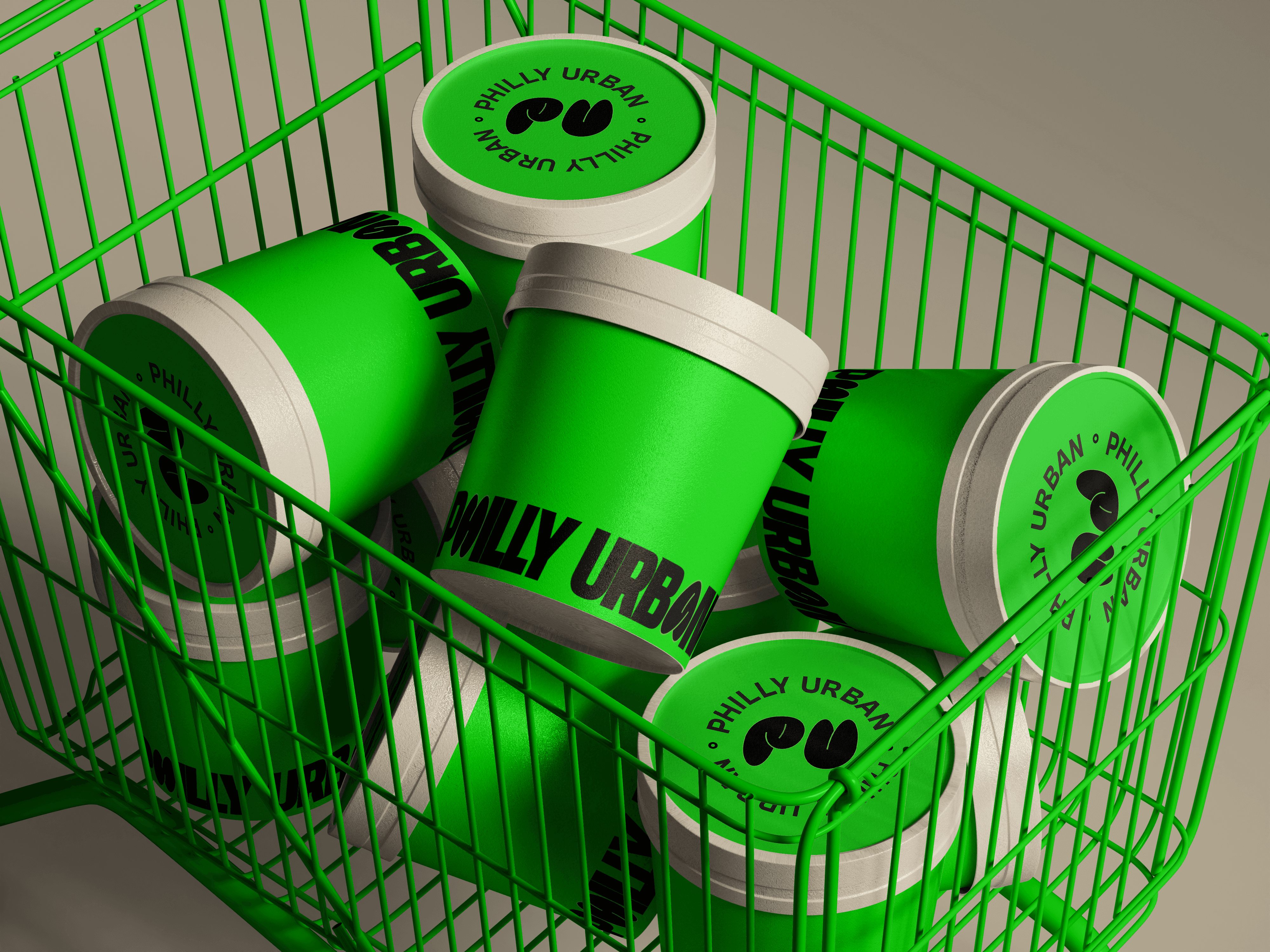
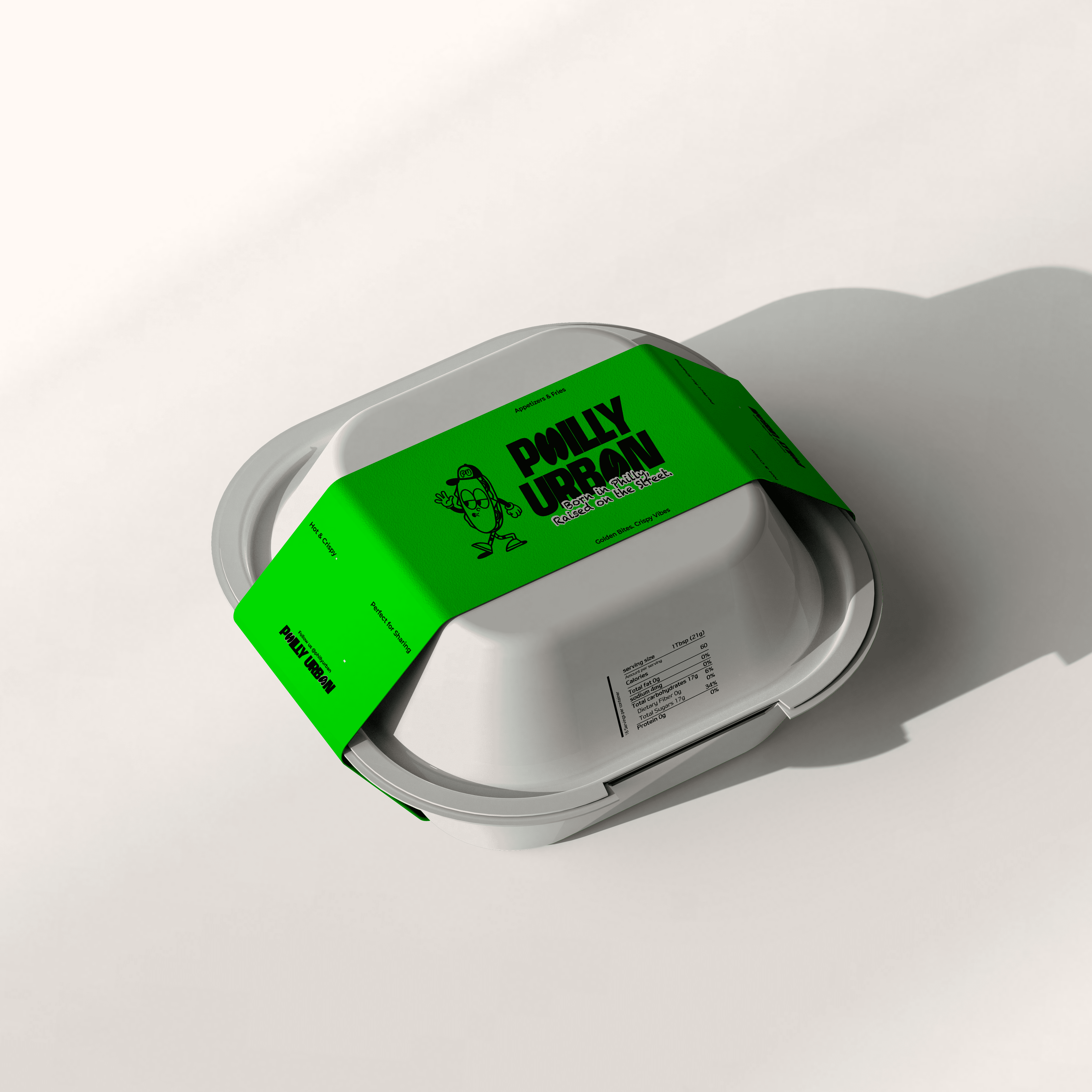
Color palette: High-contrast and high-impact — deep black, electric neon green, and soft ivory white.
Typography: A combination of condensed, experimental headline fonts and legible body text — creating tension and energy.
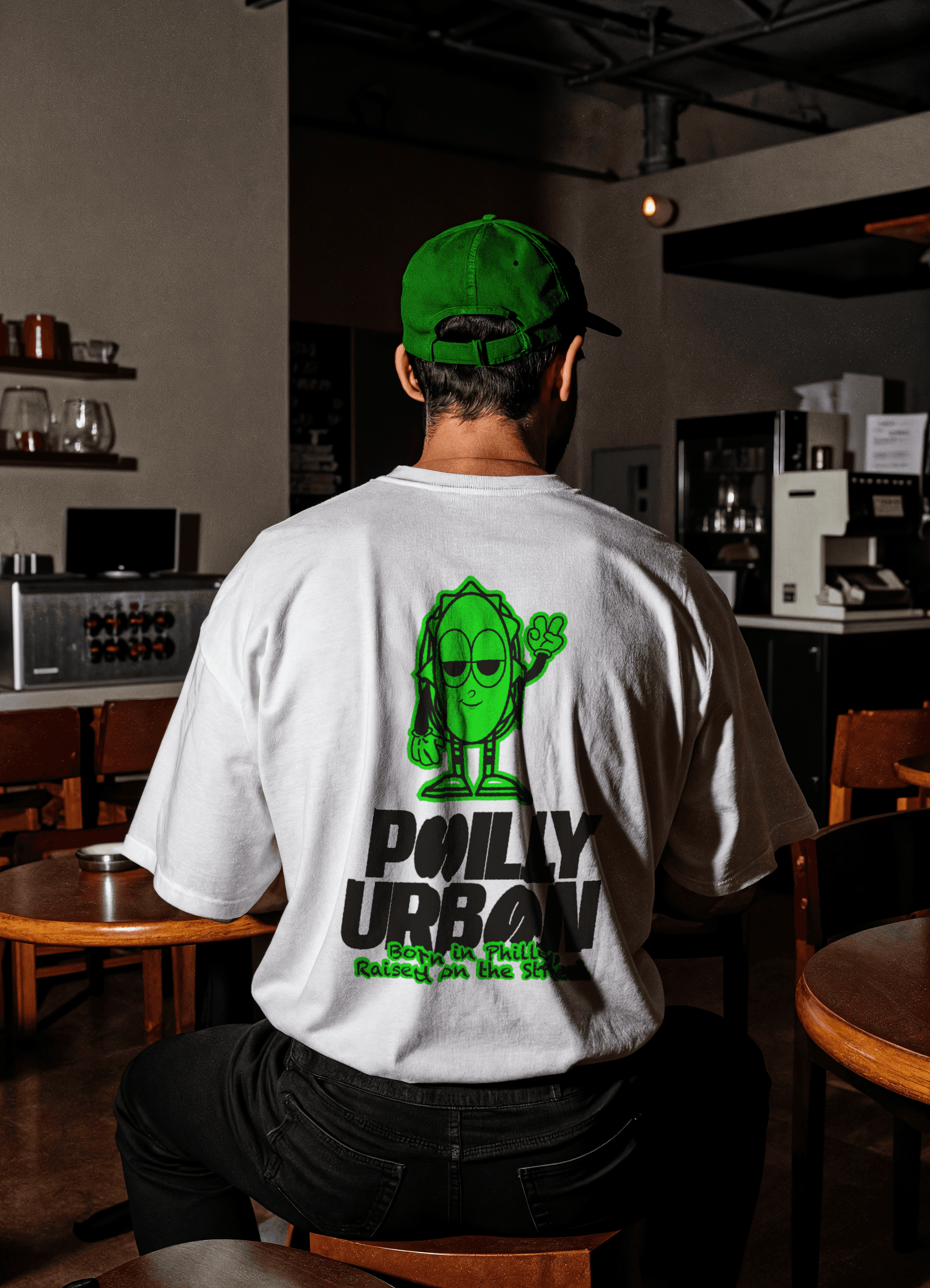
Logo suite: Custom-lettered, urban-inspired marks with dynamic tilts, irregular shapes, and graffiti influences. Includes horizontal, stacked, and submark versions for maximum flexibility.
Iconography: The peace hand gesture — a bold shorthand for freedom and individuality.
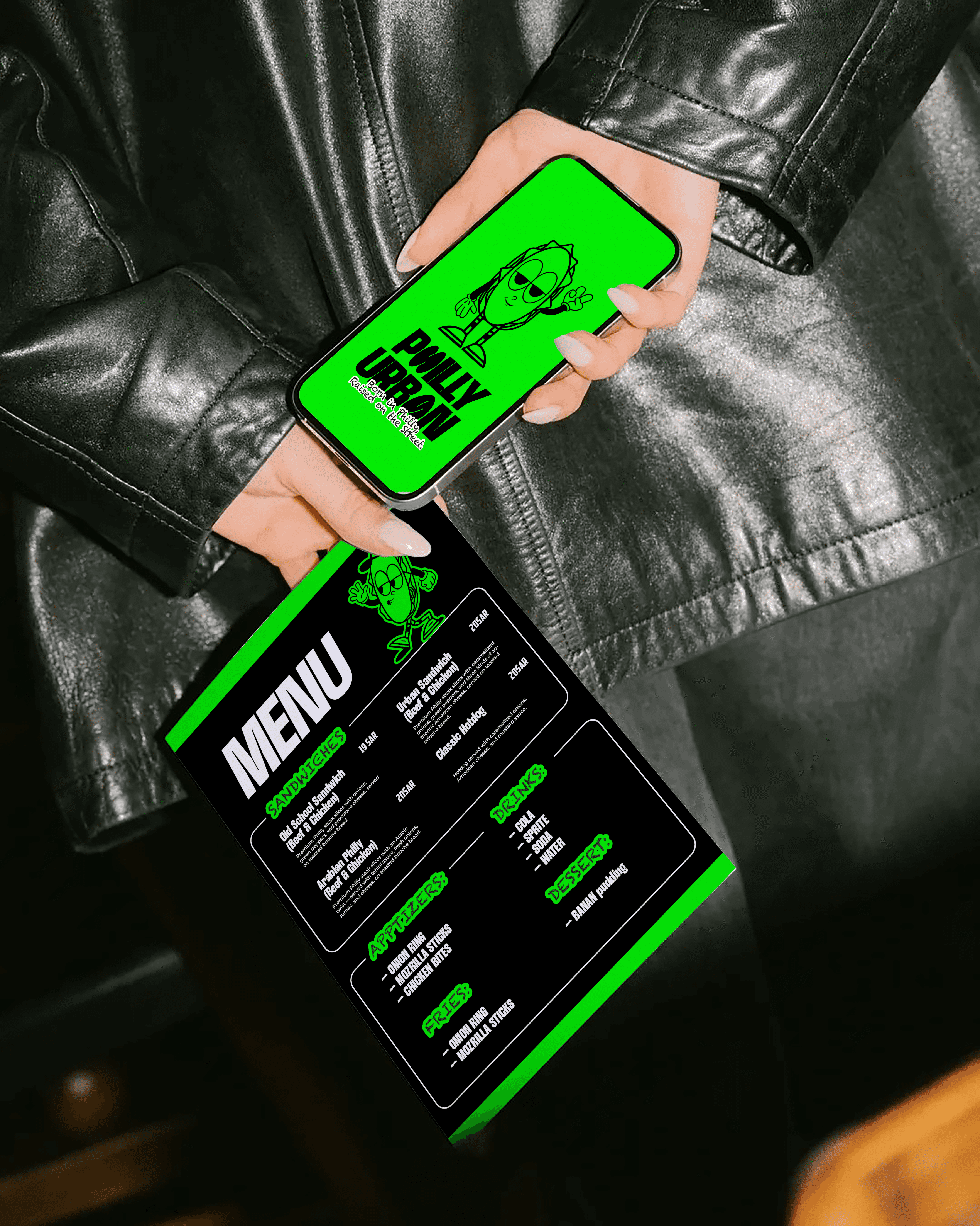
Mascot: A sandwich with attitude. Fun, confident, and instantly likeable — turning food into a relatable character.

Deliverables
Brand Strategy & Direction
Full Logo Suite (Primary, Secondary, Submark)
Color Palette & Typography System
Brand Pattern & Icon
Mascot Design
Brand Assets
Packaging Concepts & Menu Design
Social Media Look & Feel
Brand Guideline
Brand Presentation

